Approach
Qualitative Research
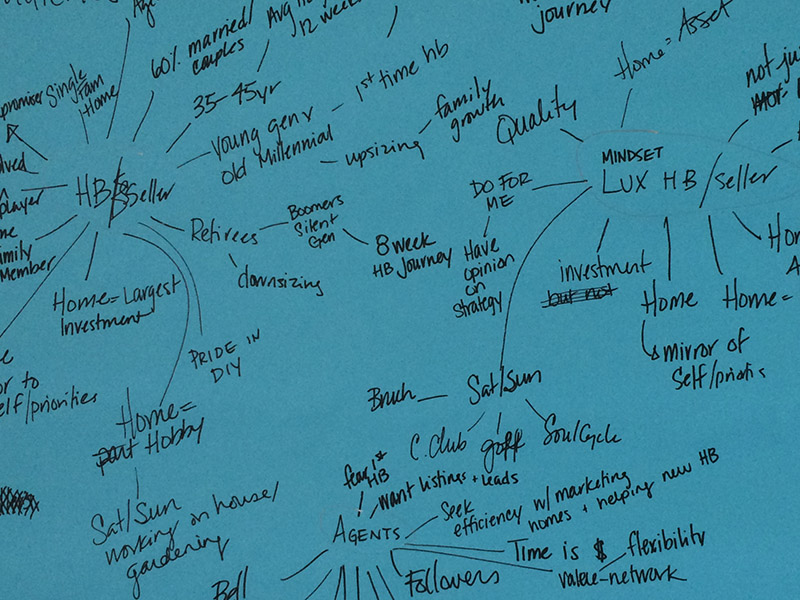
We were grateful to have significant time to conduct qualitative research, interviewing people both internal and external. Making mind maps helped our team to begin making connections between coded subjects.
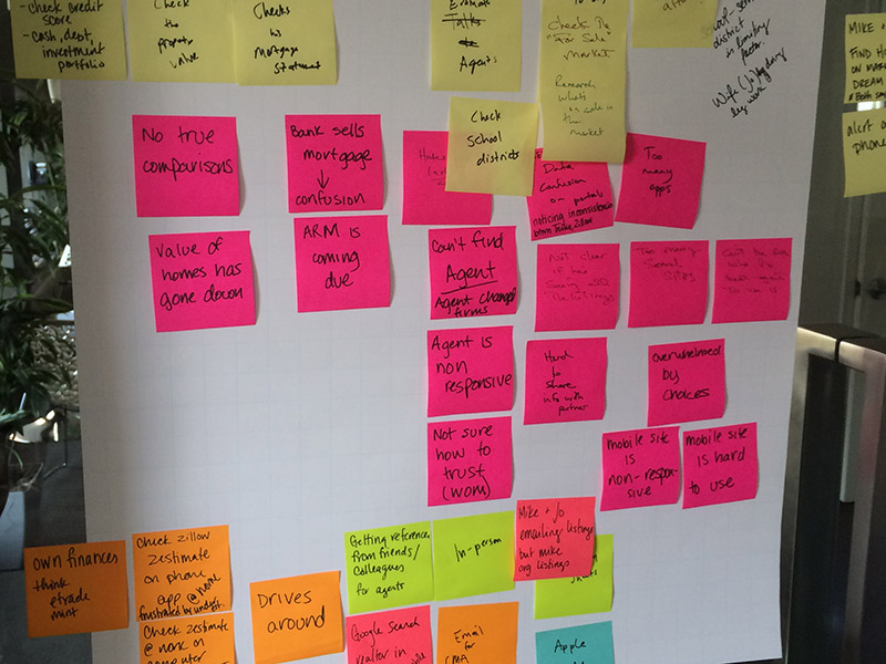
We created customer journeys and personas to get inside the mindset of each audience.
Design Debt
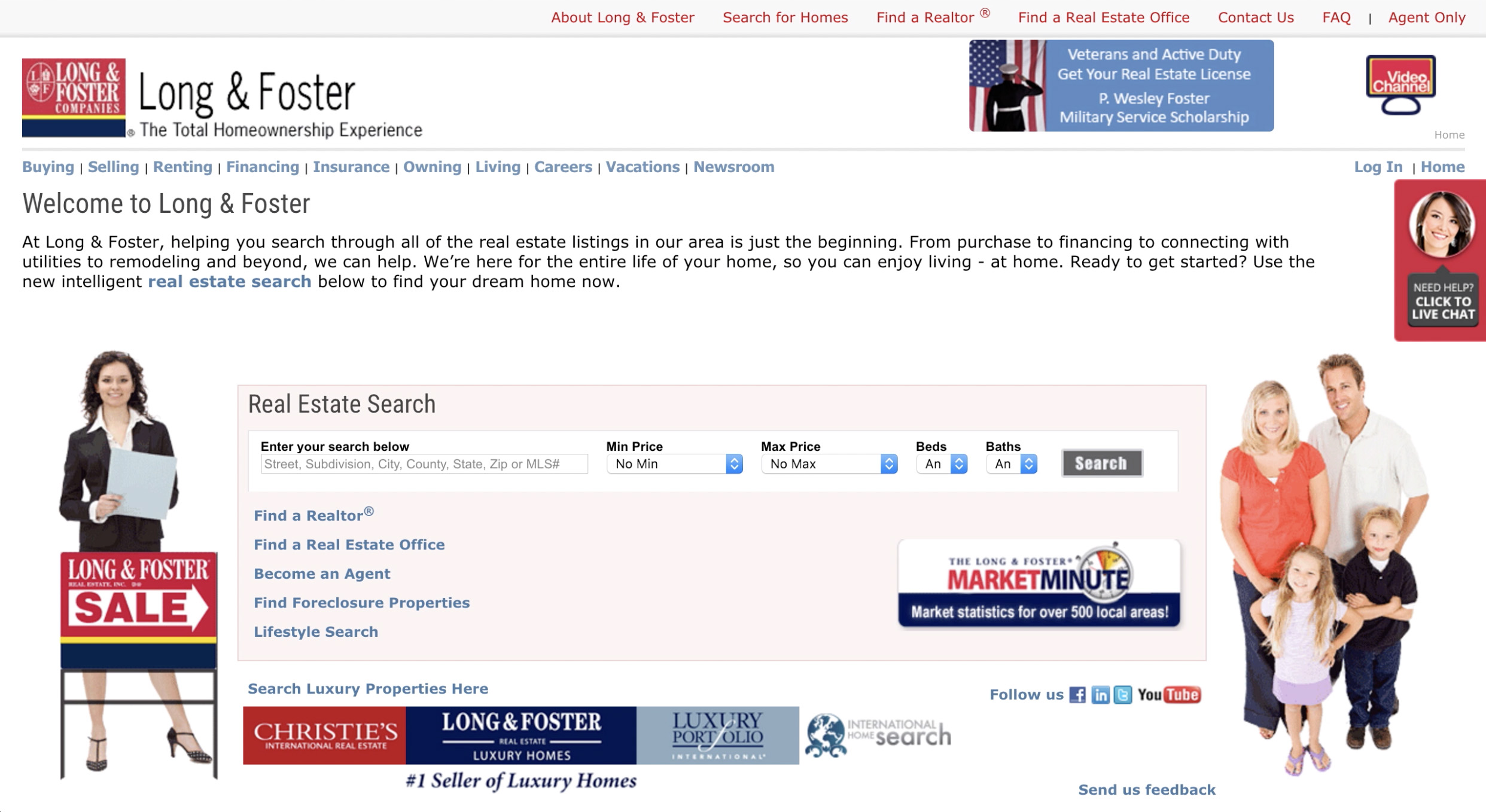
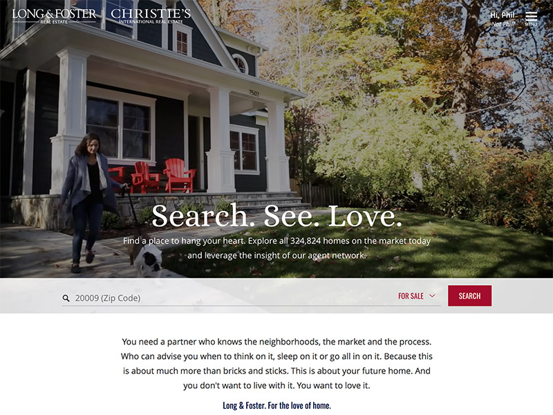
Outdated and non-responsive, the existing site at this point was not solving the goals that users have, e.g. finding houses, learning about homebuying and selling, prioritizing features, and talking with agents and staff. We had a clear starting point, but we also had the flexibility to redesign the entire web presence.
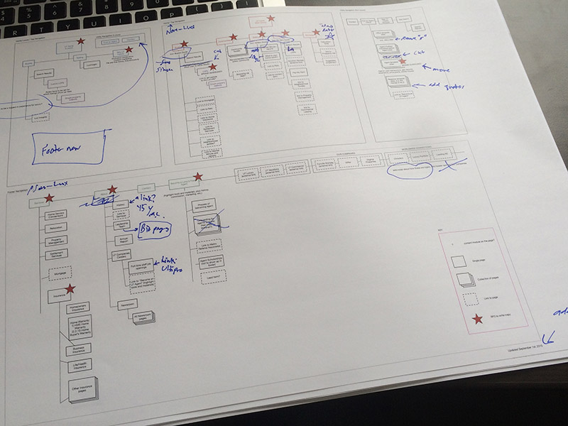
Information Architecture
Probably the most intensive and longest IA phase I've ever worked on, this step entailed card sorts, site inventory, many brainstorms, and meetings. I was taking copious notes on rough drafts over several weeks.
Component Design
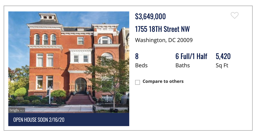
Making reusable components such as a property listing tile involved analyzing both the user goals and existing patterns to create a simple, highly usable block with meaningful and balanced visual priority.

Another example of a component: the agent card, which is customizable and flexible enough for a massive variety of data -- about 10,000 agents.
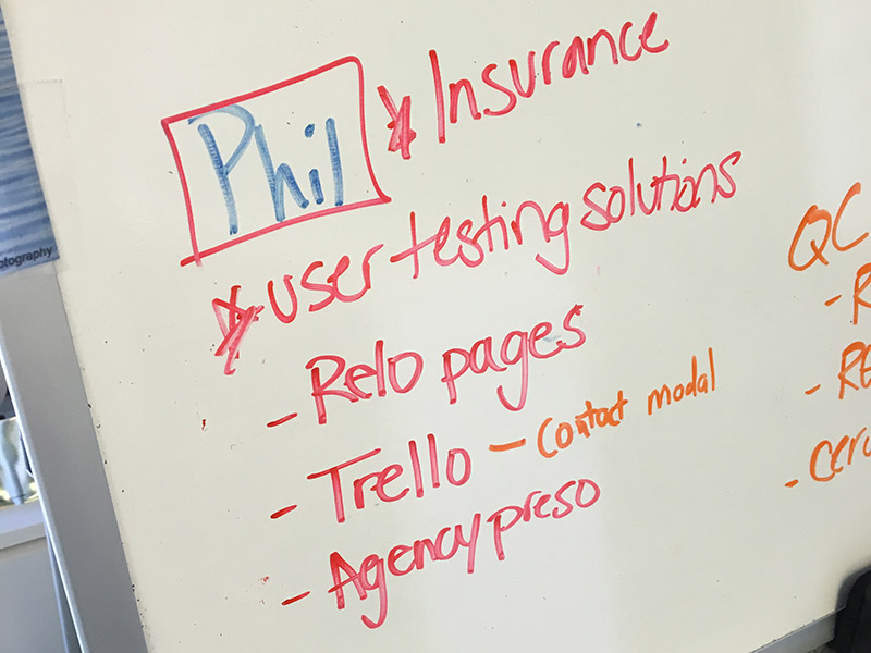
We worked in Agile sprints, designing and submitting components and templates every two weeks, then revising and iterating on them. In addition to using Trello and Jira, we sometimes utilized whiteboards for quick assignments.
At this point, we had conducted user testing, and I was in charge of fixing usability bugs, the largest being a menu system which users struggled with.
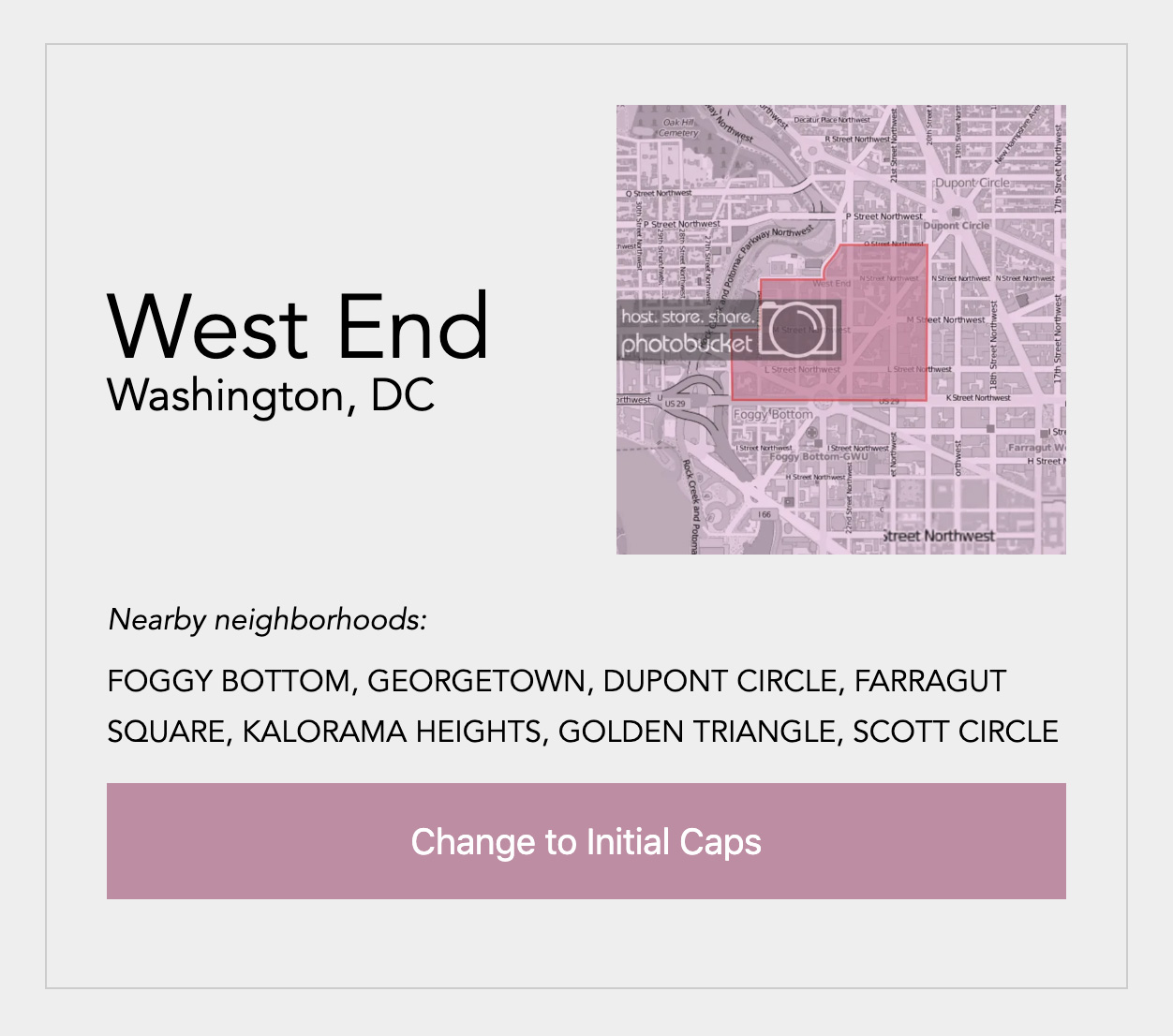
One of the issues (of many) we encountered was a data feed of neighborhood names in all caps. I wrote a regex Codepen to show our developers how I envisioned transforming it into initial caps. View the Codepen.
Release
The brand-new site hugely succeeded in all major business goals, and we also heard postitive feedback from the agents themselves. Visit the redesigned site.

Accolades
We won a W3 prize for UX, and we are consistently listed as a front-runner in the top real estate websites from Real Trends.